Add PaginationControls component#20
Add PaginationControls component#20KirklandGee wants to merge 3 commits intoWebflow-Examples:mainfrom
Conversation
Generated component following the Webflow code components scaffold pattern.
Includes full and simple prop surface variations.
|
Review the following changes in direct dependencies. Learn more about Socket for GitHub.
|
|
Warning Review the following alerts detected in dependencies. According to your organization's Security Policy, it is recommended to resolve "Warn" alerts. Learn more about Socket for GitHub.
|
1 participant
Component: PaginationControls
Description
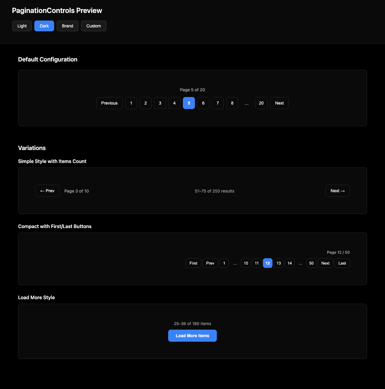
A flexible pagination component for navigating through pages of content. Displays page numbers with Previous/Next buttons, current page indicator, and total pages count. Supports three visual styles: numbered buttons with ellipsis truncation for many pages (e.g., 1 2 3 ... 18 19 20), simple prev/next arrows only, and a load-more button style. The active page is visually highlighted with accent styling. Previous and Next buttons are automatically disabled at boundaries (first/last page). Includes optional items-per-page display and a compact variant that reduces spacing and button sizes for mobile layouts. Fully responsive with touch-friendly tap targets.
What's Included
var(--background-primary, #ffffff), etc.font-family: inherit; color: inherit;PaginationControls.webflow.tsx) — 20+ props for developers/agenciesPaginationControlsSimple.webflow.tsx) — core text/link props for clientswf-pagination-controls-for Shadow DOM safetyTesting
npm install && npm run devruns locallynpx webflow library shareimports successfully